Protest, Dissent & Activism : A Cataloguing of Campus Climate
About
The Leftovers
Laila
I’m a rising senior at Vassar College majoring in Cognitive Science and minoring in English. I’m from San Miguel de Allende, Mexico!
Liz
I’m a rising sophomore at Vassar College majoring in American Studies. I’m from Scituate, Massachusetts.
Sarah
I’m a rising junior at Haverford College majoring in both Anthropology and International Studies. I’m from Bangalore, India!
Jonathan
I’m a rising junior at Hamilton College majoring in Psychology. I’m from Bridgeport, Connecticut.
Process
As a group we decided to explore the history of protest at our collegiate institutions. We found Haverford’s and Vassar’s archival resources to have the most potential, therefore we focused on the dialogue of protest between their respective college climates. Given that colleges are centers of social change, where students dissent from larger social trends or administrative decisions, we felt this endeavor would be fruitful in our aims to better understand the significance of protest over time. We wanted to uncover the patterns hidden in what exactly students protested against, how they did it, as well as the progression of their protest over time. Further, we were curious as to the preservation of these protests; How is their history preserved? Who chooses to do so? What is deemed worthy of preservation?
After honing in on our research questions and objectives, we began to tackle the execution of our ideas. We split the work into stages, meeting frequently to stay on track and maintain the cohesiveness of our project. We first started by narrowing in on the particular methods we believed would be best suited to answer our questions. After some dry runs of different tools we had previous knowledge of or were exposed to over the course of this class, we decided to create a Google spreadsheet. We prioritized the ability to collaborate and using Google sheets supported us in that endeavor, allowing us to be in constant conversation with each other and our respective contributions to the project. We then proceeded to break into pairs, with Jonathan and Sarah tackling Haverford’s archives through the TriCollege Libraries Digital Collections archive, the Institutional Scholarship (the TriCollege Libraries Institutional Repository) site and the Haverford Open Access and Digital Pedagogy Resources website, and Laila and Liz tackling Vassar’s archives through both The Vassar Digital Newspaper & Magazine Archive and the Miscellany Newspaper Issuu archive.
From there, we began to collect and log data in our spreadsheet, accumulating in total fifty-two instances of protest, dissent, or activism. Our searches were anchored by the term protest but we remained open to the broader sentiment of dissent and activism using our own subjective interpretations of texts or images. In that way, we utilized the digital tools to their best ability while also supplementing with our own critical analysis skills. The data was organized by categories that we constructed ourselves. Given the collaborative nature of our project and data logging, the standardization of the data varies. However, we decided to embrace that aspect of our project as we fully acknowledge the highly subjective lens we worked through. We don’t intend for our project to serve as a comprehensive catalogue of all instances of protest, dissent, and activism throughout each school’s history, but rather a humanistic attempt by subjective individuals to bring the data to life, in all its glory (flaws included).
Once we completed our collection and logging of data and successfully documented our sources, we then transitioned into our data visualization stage. We spent time brainstorming how we thought the data would be best presented and our project’s story best relayed. We decided to use a mixture of visualizations: a timeline, pie charts, bar graphs, word clouds, a map, and a table. We were curious to see how these different visualization methods could add new and interesting layers to our overall analysis.
Ultimately, what we present is a snapshot of protest across two liberal arts colleges, analyzed by means of various visualizations, in hopes of delivering a complex and compelling, but also very human, account of our histories as students and futures as changemakers.
Subjectivity
One important consideration to be made is that sometimes, only visible protests are remembered or recorded. This could mean that protests that divest from the traditional understanding of loud, obvious, active resistance may not be as represented in our college archives.
Also, all the members of our team are students at our universities. Plus, the majority of the recorded protests from our colleges are conducted by students. This could mean that, as students, we care more about ourselves and our time at college than the community around us or affected by us.
Lastly, as a group, we are almost all very new to the skills we used for the creation of this project. As a result, we had to use tools and techniques we were only taught in this course, and that we knew well, as opposed to what may have actually been the best tool or technique for the tasks we had.
Room to Improve
One major downside of our project is the method we used for our data collection. Because of the limiting time and scope of our project, we ended up choosing the data based on a range of variables. Firstly, we had to have enough information about the event to substantiate our analysis. Secondly, we chose events that we thought were interesting and did not have a set/strict way to reject events. Lastly, some of the information we skipped we did so just because we knew we wanted to present some sort of a range of dates on our timeline; had we worked through the variety of information in our college archives, we would have only managed to get to so many from a very close range of years.
Another potential failing of our project is that the information we gathered for it is not exhaustive. While our schools’ archived collections are vast and complex, they are not complete representations of the past. There is a large possibility that they are only versions of events, as is with any study of history, that represent the interests of those in power. The archived materials from our colleges may have a specific recorded history that may be different to—or not representative of—the interests of all parties, even on campus.
A purely technical flaw is the search by tag section of the timeline. The basic R Shiny App tools available were not equipped for a search that required matching one word among many of them, instead of matching exact words. With more time it would have been possible to improve the tag function, but for the moment it is a little finicky.
Timeline
The data can be filtered through categories at the top or through the date range. Items from the timeline can be selected and the information about particular protests pops up below the timeline. The table at the bottom contains all of the information that is being portrayed in the timeline.
Visualizations
Analysis:
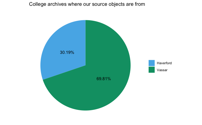
Obviously, two thirds of our data came from Vassar College while only a third came from Haverford. This was an interesting result of the different forms of archives of the colleges and the culture of each institution: Haverford does not have a formal newspaper. Instead, most recent correspondence occurs online on two sites – neither of which are being archived institutionally.
Also, Haverford is about half the size of Vassar and as a result, may have less recognised protests due to the smaller scale of issues at Haverford. While the Vassar College newspaper textually covered almost every issue from a huge period of time, Haverford had a large resource of information for specific events (including images and digitized exhibits).
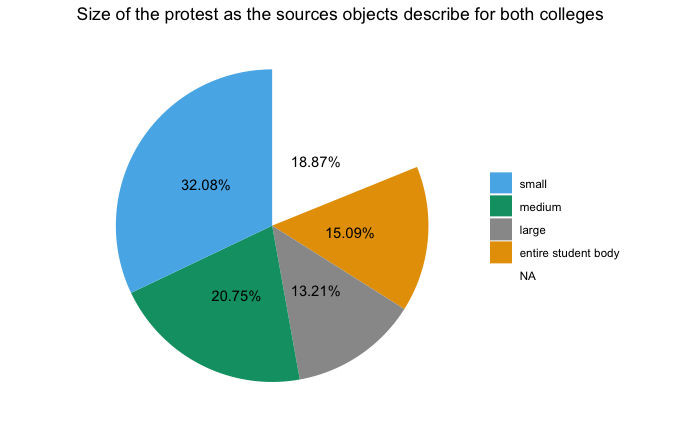
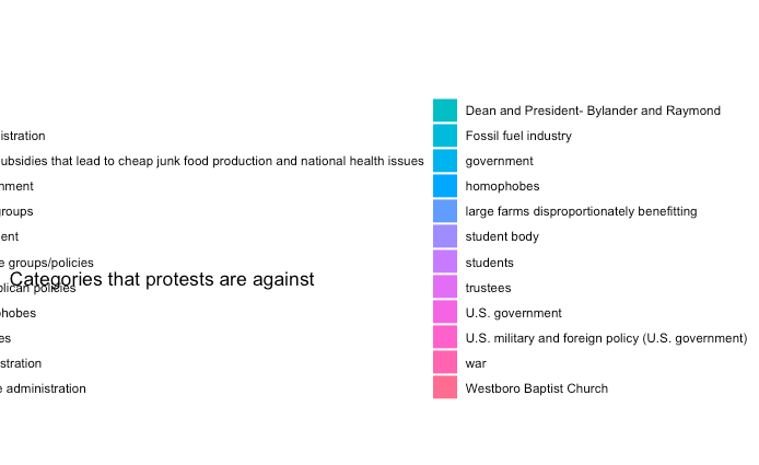
Tracking who the protests are against:
This is an attempt to track what the protests were standing in opposition to. It is meant to be a pie chart, but there are so many categories that they render the visual unreadable in a traditional sense.
We include it here to highlight how complex student protests are and how so much of it needs to be flattened or simplified for distant reading. These tags are highly specific, which makes visualization harder. However, if we had tagged more general issues so much of the nuance would have been lost.
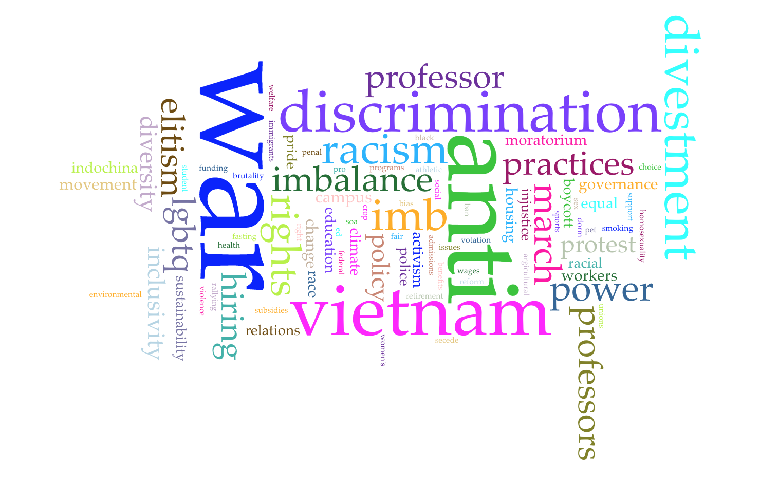
Umbrella Tags:
We noticed in this visualization that the most common words were war, anti, vietnam, discrimination, divestment, and racism. We interpret this to mean that a portion of our data highlights the significance of the Vietnam War and students’ attitudes towards it. We also view this observation as commentary on the relationship between mainstream media recognition and protest. War is a large-scale event and therefore has more likelihood of affecting more people and causing reactions of support or opposition.
We can glean from this that other protests, surrounding civil rights, racism, and climate change were not and still have yet to be viewed as mainstream conflicts affecting the majority of the population like the Vietnam War had.
It is also interesting to note that protest is often framed in terms of “anti” meaning the focus is often on what a group opposes rather than what they stand for. There may be more potential for analysis on that point.
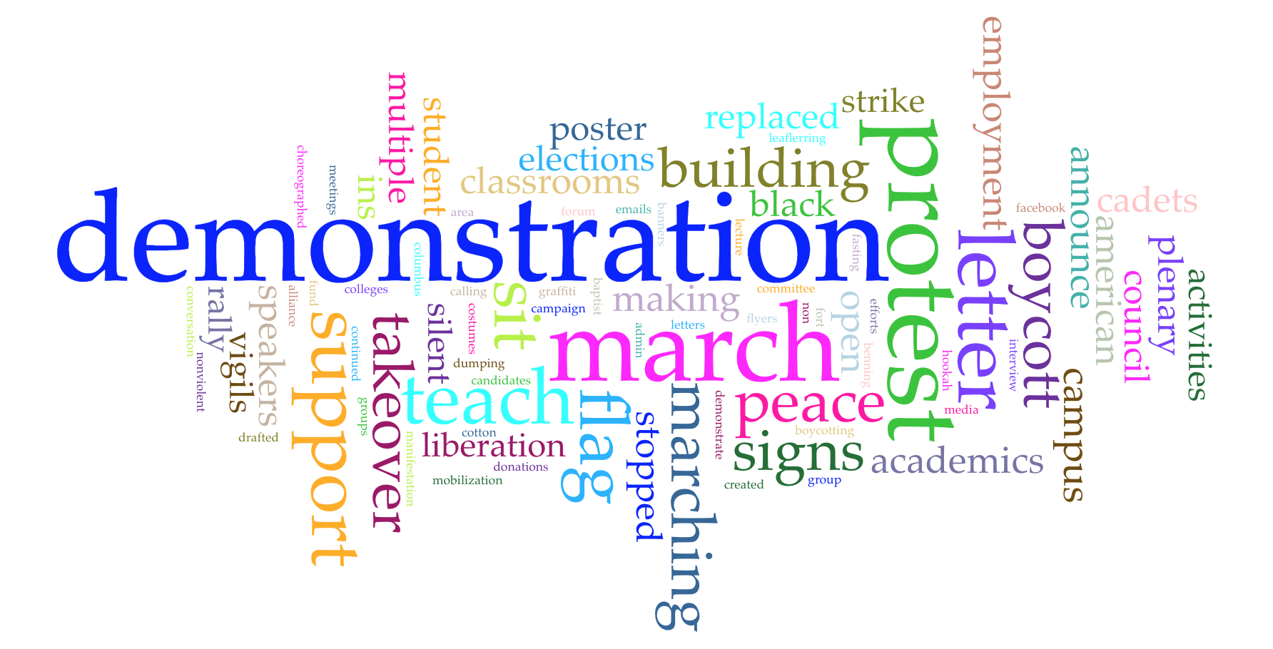
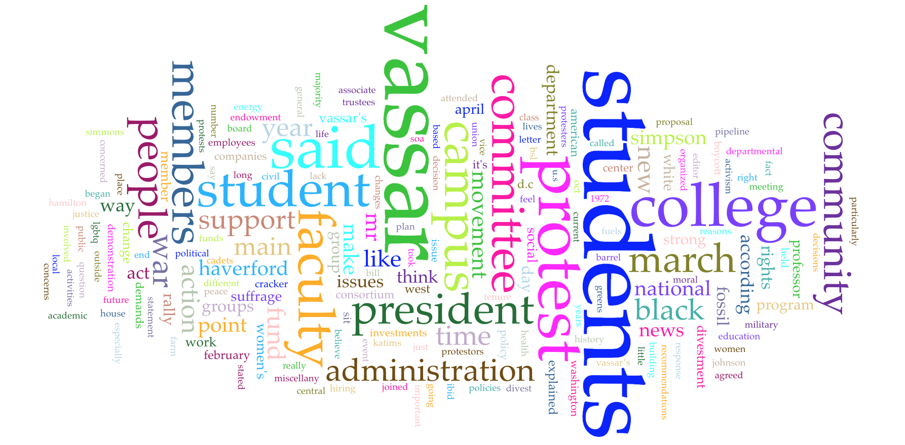
How/Method:
From this visualization we drew the observations that demonstration was the most common description of the method of protest. We take this to mean that demonstration is an accessible and open-ended concept allowing for it to suit many different causes.
We also noticed that other common methods of protest were to march, teach, write letters, offer support, and boycott.
It was interesting to note the more common methods of protest, as we feel they have the potential to provide insight for future protests and their effectiveness, but it is also worth mentioning the uniqueness of some of our objects’ methods of protesting and the power in memorability.
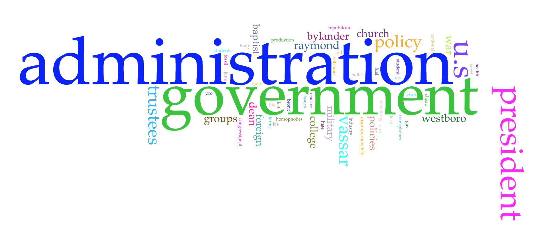
Protesting Against:
We observed administration and government to be the two predominant oppositions with regards to campus protests. It is not that surprising but it is worth acknowledging, especially for potential leaders to know and expect that protest is designed to challenge the status quo of power.
We find this in line with informal and personal observations that protest is unpopular with authority in the moment, but holds the potential to better authority in the long term. Protest is cyclical and retains its continuity in its constant challenging of power and authority.
All of the Text OCR :
With this final visualization, it is truly the culmination of all of our sources and our most raw analysis of the data. Unlike the other visualizations, in which we constructed categories and systems of measurement as a group, this visualization is simply an overview of any and all textual patterns present in the texts.
It was an interesting textual analysis to end with, as it challenged the implications our subjectivities played in some of our analysis and allowed for a sense of open-endedness that we appreciated. We encourage the audience to form their own takeaways and see how it fits into the rest of our project.
Table
| College | Date | Method | Effect |
| Haverford | 1905-02-8 –> 1905-02-25 | disruption, boycott, silent vigils | 16 symbolic gestures met |
| Haverford | 1905-05-20 | marching, poster making | No known |
| Haverford | 1905-05-20 | demonstration | No known |
| Vassar | 1967-09-27 | teach-ins, lecture series, cross college alliances | No known |
| Vassar | 1970-02-21 | boycott, signs | No known |
| Vassar | 1970-02-27 | fasting, rallying | No known |
| Vassar | 1970-04-10 | meetings, open letters | No known |
| Vassar | 1970-04-10 | portfolio, open letter | No known |
| Vassar | 1970-11-20 | secede | No known |
| Vassar | 1996-04-26 | diversity, inclusivity, same-sex dorm, Women’s Rights | kept dorm same-sex, demands met |
| Vassar | 2000-12-01 | nonviolent, choreographed protest | No known |
| Vassar | 2012-12-06 | campaign, proposal | No known |
| Vassar | 2013-02-28 | banners and letters of support | No known |
2/13
IS THE RATIO OF OBJECTS WITH ‘KNOWN EFFECT’ TO ‘NO KNOWN EFFECT‘
Analysis
We drew inspiration for this table of ‘no known effect’ data, specifically from artist, designer, and educator Mimi Onuoha as referenced in Data Feminism by Catherine D’Ignazio and Lauren Klein. Her project, The Library of Missing Datasets, strongly influenced our decision to highlight how much protest is often treated like a temporary outburst and is hardly followed up with.
It is possible to interpret this table to mean that protests are not effective. However, we feel that conclusion would feed into the fallacy that numbers do not lie. Instead, we choose to view this table as a reminder to pay more attention to the lifespans and effects of protests. We encourage individuals to be more conscious of what data is tracked, like Onuoha highlighted, and in doing so practice a mindset of futurity and sustainability. We believe this could help our protests and their objectives live beyond their historical moment.
We think that, in the dialogue of protest, effects and outcomes deserve to be more thoroughly analyzed so that we can better understand our protests in the future.
Map
Link to sources & code
Timeline: This timeline is hosted at ShinyApps here and the code is available on GitHub here.
Pie charts and bar graphs: GitHub code is available here.
Google sheet: The collated data that our project used is here.
Map: The code template we used for our map is available here and the Google sheet we used for our map data is here.
Archive sources:
- Magazine Archive. https://newspaperarchives.vassar.edu/?a=cl&cl=CL1&sp=miscellany&e=——-en-20–1–txt-txIN-protest——-
- The Miscellany News. Miscellany Newspaper Issuu archive. https://issuu.com/miscellanynews
- TriCollege Libraries Digital Collections. https://digitalcollections.tricolib.brynmawr.edu
- Institutional Scholarship (TriCollege Libraries Institutional Repository). https://scholarship.tricolib.brynmawr.edu/
- Haverford Open Access and Digital Pedagogy Resources. http://digitalpedagogy.haverford.edu/